A well-crafted Call-to-Action (CTA) is one of the most powerful tools in online marketing. Whether you’re looking to increase conversions, drive engagement, or boost sales, a clear and compelling CTA can make all the difference. In this article, we’ll explore tips for creating effective call-to-action buttons and dive into the psychology behind successful call-to-action statements, helping you design CTAs that grab attention and prompt action.
1. Use Action-Oriented Language
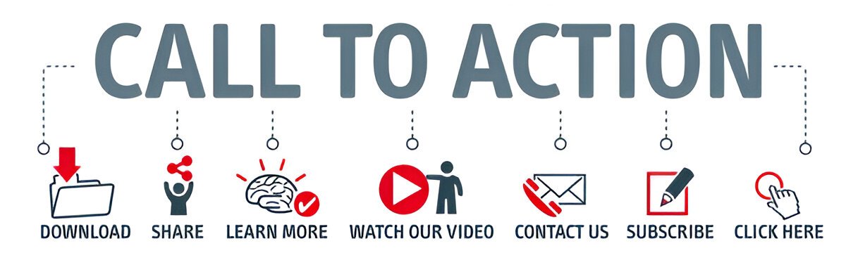
The first step in creating an effective call to action button is using action-oriented, imperative language that encourages users to take the next step. Words like “buy,” “download,” “subscribe,” “get started,” and “learn more” all inspire immediate action. By making the CTA a command, you’re directing your audience to do something right away.
For example, instead of using a vague CTA like “Click Here,” try something more specific like “Get Your Free Trial Now” or “Start Your Journey Today.” This clear direction boosts the chances of your audience engaging with the CTA.
2. Make It Visually Stand Out
Your effective call to action buttons should be easily noticeable. Visual appeal plays a huge role in whether or not users interact with your CTA. Use contrasting colors, large fonts, and a design that makes the button stand out from the rest of your content. Keep the button’s shape simple, but make sure it catches the eye without being overly distracting.
Additionally, adding some white space around the CTA allows it to breathe and prevents the page from feeling too cluttered, making it easier for visitors to focus on the action you want them to take.
3. Use Urgency and Scarcity
Incorporating urgency and scarcity into your CTA can motivate users to act quickly. Phrases like “Limited Time Offer” or “Only 3 Spots Left” tap into the psychology of urgency, encouraging people to take immediate action before they miss out.
The psychology behind successful call-to-action statements often hinges on a sense of urgency. When people perceive that they may lose an opportunity, they are more likely to act quickly. Whether it’s a limited-time discount or an exclusive offer, this strategy leverages FOMO (fear of missing out) to drive engagement.
4. Provide Clear Value Proposition
Your CTA should clearly communicate the benefit of clicking on the button. Be specific about what the user will get after they click. For example, instead of simply saying “Subscribe,” use “Subscribe to Get Exclusive Tips and Discounts.” This communicates a clear value proposition, helping users understand why they should take action.
By being specific about the benefits, you align the CTA with the user’s needs, which can drastically increase conversion rates. The psychology behind successful call-to-action statements emphasizes highlighting the immediate rewards of taking action.
5. Test and Optimize Your CTAs
Creating an effective call to action button isn’t a one-and-done process. You should continuously test and optimize your CTAs for better performance. A/B testing different colors, wording, placements, and sizes can give you valuable insights into what works best for your audience.
For instance, you might find that “Try Free for 30 Days” works better than “Get Started Now” for your specific audience. Always analyze the performance of your CTAs to ensure they’re delivering the best results.
6. Use Personalization
Personalized CTAs are more likely to resonate with your audience. If you know something about your user’s interests or behavior, use that to tailor the CTA. For example, if someone has recently browsed your products, a CTA that says “Complete Your Purchase” feels more personal and relevant.
Personalized CTAs make users feel like the offer was designed specifically for them, which can lead to higher engagement and conversions. The psychology behind successful call-to-action statements shows that users are more likely to respond to content that feels tailored to their needs.
7. Place CTAs Strategically
The placement of your CTA can significantly affect its effectiveness. While it’s common to place CTAs at the end of content, consider placing them multiple times throughout a page, especially in long-form content or product pages. For example, a CTA button can be placed both at the top and bottom of an article or within the middle of a product description.
It’s important to make your CTA feel natural and relevant to the content around it. A strategically placed CTA keeps users engaged and prompts them to take action without feeling pressured.
8. Be Concise and Direct
When crafting your CTA, brevity is key. Users should immediately understand what they’re being asked to do, so avoid using unnecessary words. The CTA should be short, to the point, and easy to understand at a glance.
Instead of saying, “Click here to discover all the benefits of our new software,” opt for something more direct like “Discover the Benefits Now” or “Start Your Free Trial.” This clear, concise wording helps increase engagement and drives conversions.
Conclusion
Creating effective call to action buttons is an art that combines design, psychology, and language. Understanding the psychology behind successful call-to-action statements allows you to craft CTAs that appeal to your audience’s emotions, needs, and desires. By following these tips—using clear, action-oriented language, creating urgency, optimizing for value, and continually testing—you can improve your conversion rates and drive more meaningful engagement with your brand.
Remember, the key to a successful CTA is to make it compelling, relevant, and easy to act upon. By perfecting these elements, your CTAs will not only attract attention but also inspire action.